PROJECT
Aurora App, Website & Branding
ROLE
Product Designer
SUMMARY
An app to control Philips Hue Bluetooth Lightbulbs with delightful animations and interactions.
No longer in the app store
CHALLENGE
Philips Hue already had an app in the app store but we felt we could improve upon its aesthetic and include some additional features that would make the app more user friendly. We used the API to create a beautiful iOS and Android app to control the bulbs.
RESEARCH METHODS
Since we were users of the original Philips Hue app we knew there were ways to improve it. We validated our hypothesis by further user and market research.

User Interviews

Personas

Journey Mapping

Market Research Analysis

Prototype Testing
PROJECT GOALS

Add functionality that would allow groupings of bulbs so that users can quickly control large groups of bulbs at a time (rooms).
Add functionality that would allow groupings of bulbs so that users can quickly control large groups of bulbs at a time (rooms).
Add functionality that would allow groupings of bulbs so that users can quickly control large groups of bulbs at a time (rooms).
Add functionality that would allow groupings of bulbs so that users can quickly control large groups of bulbs at a time (rooms).

Make the interface more intuitive and easier to use than the existing app. Teach user how to use the app through a simple on-boarding process
Make the interface more intuitive and easier to use than the existing app. Teach user how to use the app through a simple on-boarding process
Make the interface more intuitive and easier to use than the existing app. Teach user how to use the app through a simple on-boarding process
Make the interface more intuitive and easier to use than the existing app. Teach user how to use the app through a simple on-boarding process

Make the app more beautiful and fun, providing visual feedback to the user along the way through gestures and interactions.
Make the app more beautiful and fun, providing visual feedback to the user along the way through gestures and interactions.
Make the app more beautiful and fun, providing visual feedback to the user along the way through gestures and interactions.
Make the app more beautiful and fun, providing visual feedback to the user along the way through gestures and interactions.
INTRODUCING AURORA
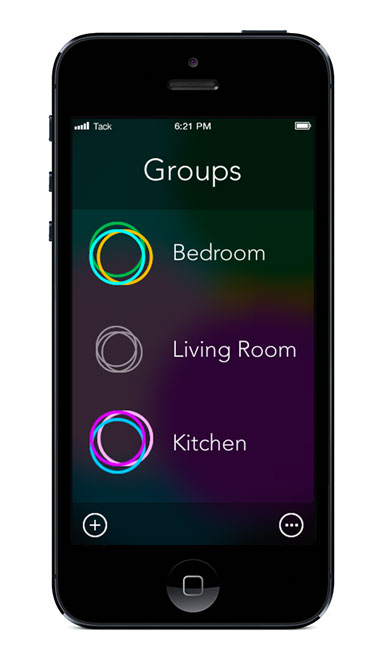
With the Aurora App, users could easily organize their individual lights into rooms, something that was not available with the existing app. It made switching rooms on/off easy, and was fun to use.
GROUPS/ROOMS CONTROL
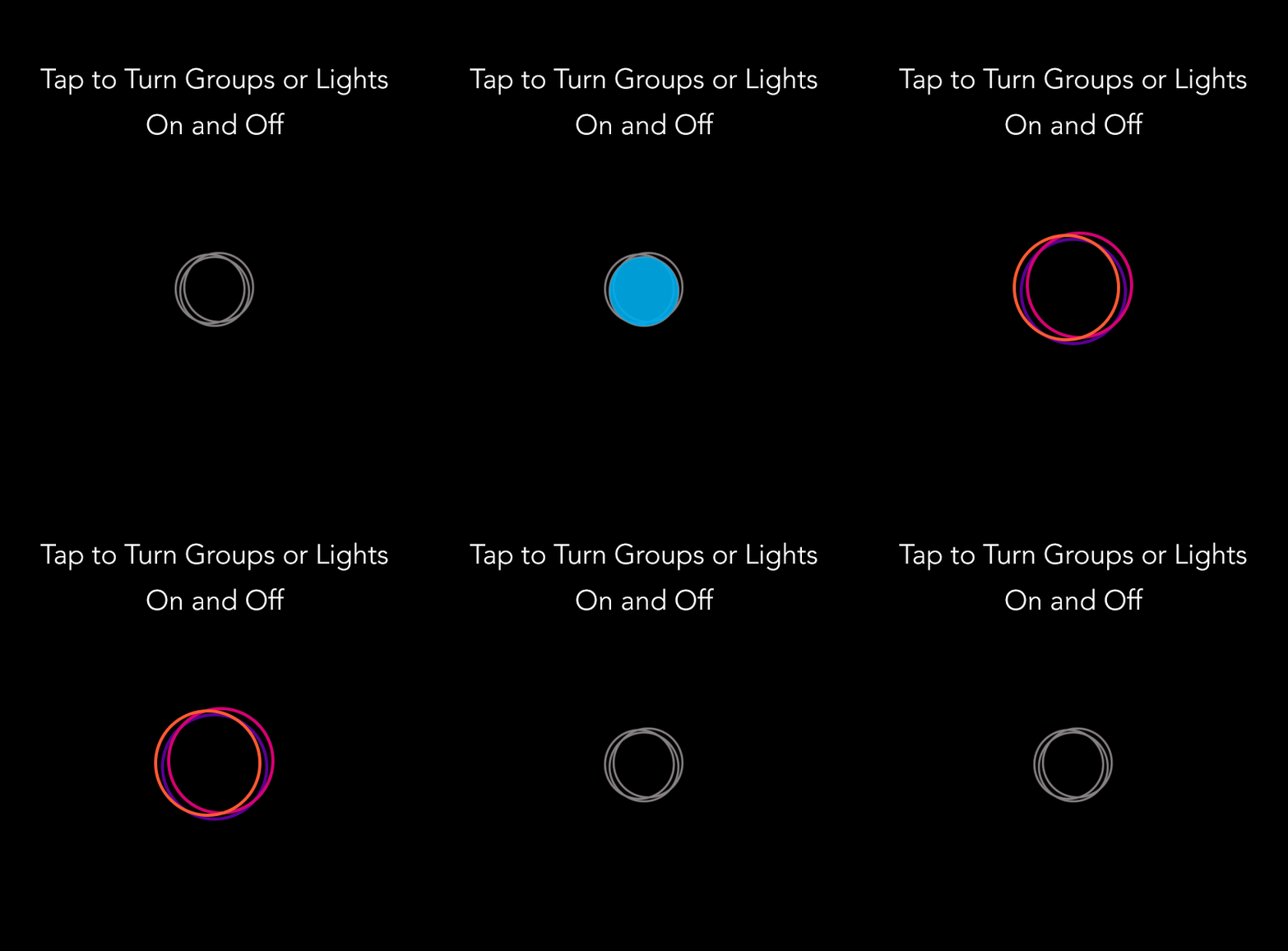
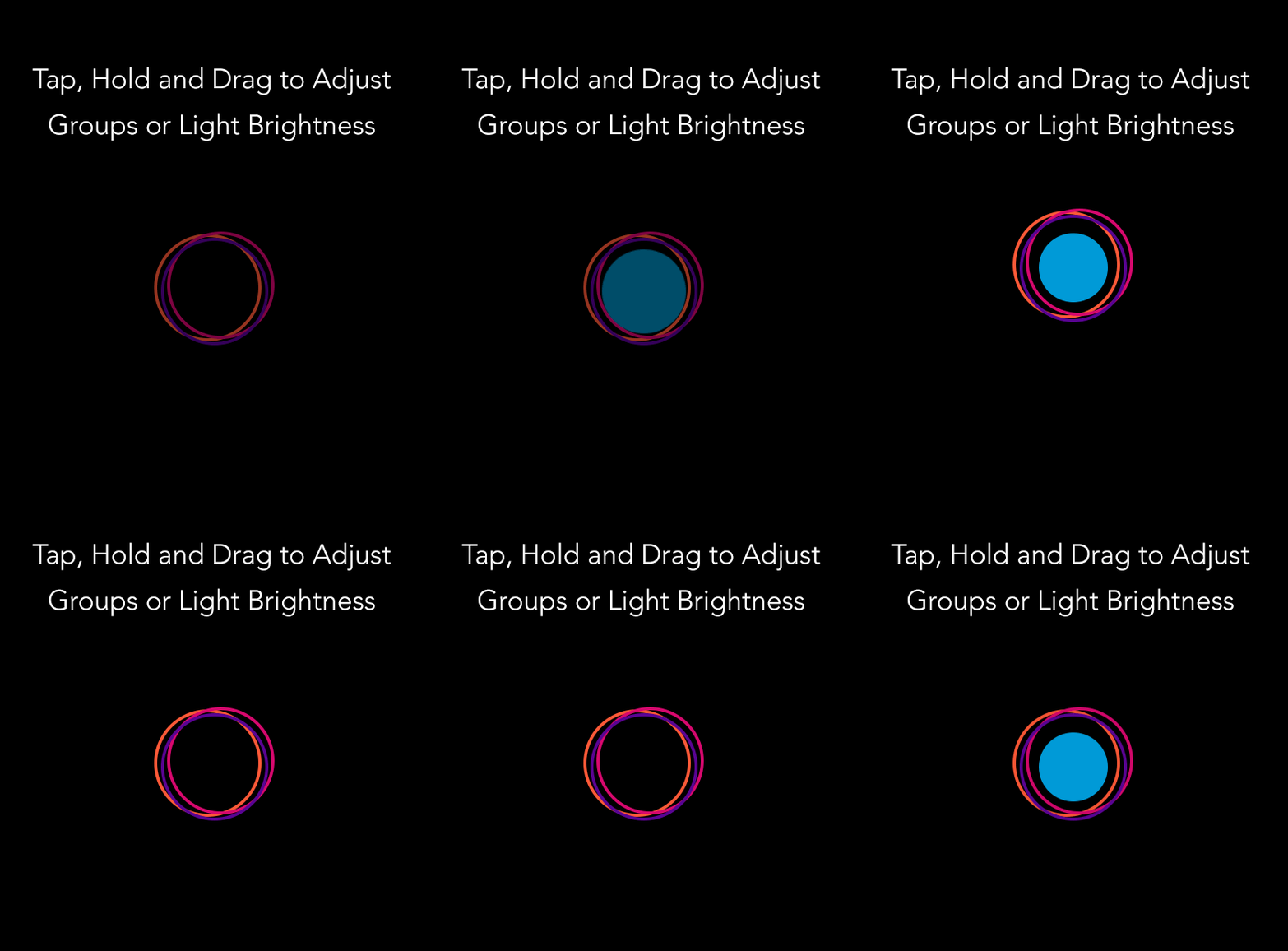
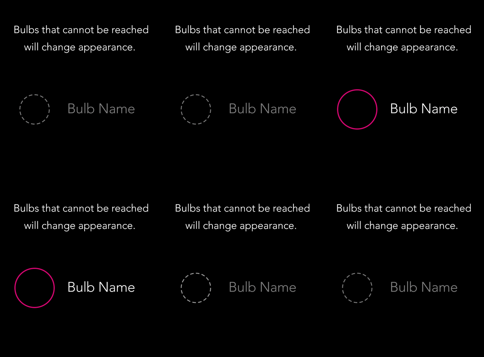
The existing Philips Hue app did not have the ability to control groups of bulbs at once making it a tedious task to control a rooms lights at once. We added the functionality to make it much easier on the user. Each bulb in a room is represented by a circle. That circle could either be on (colored circle) or off (gray circle) or not detected by the bridge (gray and dotted line circle). The user can quickly tap the group of circles on or off. They could also drag the group up or down on the screen to brighten or dim the lights in the room.
INDIVIDUAL BULB CONTROL
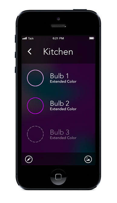
Within each room is a series of individual bulbs. From here the user could tap them on or off and dim or brighten them the same way as on the groups screen.
VIDEO DETAIL
We optimized the video player to maximize the video space while encouraging engagement with the video. We included a swipe to show additional information. Users can send gifts to show love and participate in the conversation with other fans and artists. Because there is so much unique content in the platform, we included a description and additional tags for eaze of search.
CUSTOMIZING THE BULB
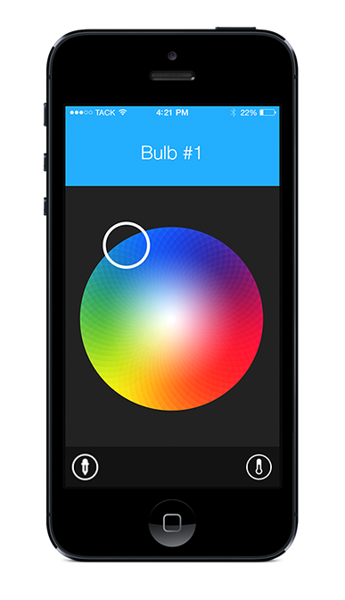
We improved the color picker and brightness scale. On the existing app, the color picker did not take into account people with larger fingers. Some users had difficulty knowing which color they were choosing because their finger was covering the picker. We improved the experience by showing the color in the header that their finger is over making it easier to choose the right color.
BRANDING
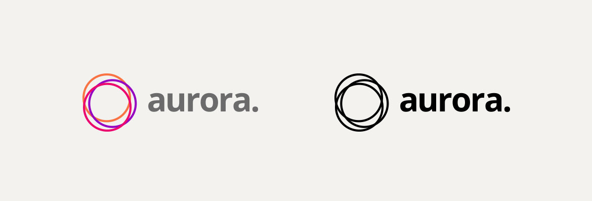
The app branding was inspired by the UI bulb controls, the circle motif was repeated in multiple areas of the marketing and branding. The name was inspired by the northern lights or Aurora Borealis.
MARKETING WEBSITE
Because this app requires hardware to function, anyone who downloads the app would not have been able to play with the app unless they have purchased the lightbulbs and bridge. So to combat this problem, I decided that the website needed to show how the app works for the user who doesnt have the hardware.... yet. I wanted people to see how easy and beautiful the app is so that people felt enticed to purchase the hardware. We created a stunning one-page website that animates as the user scrolls down the page. Mimicking the phone and how the controls manipulate the environment around it.
MORE PROJECTS
